Balloon colour palettes help corporate event teams coordinate decorations with their brand, venue and occasion. Choose a main colour, supporting shades and a finish, then review them alongside signage and lighting. For a Singapore launch, staff celebration or reception, send Twist Concept your brand references and venue photographs to discuss a suitable arrangement.
How do you choose balloon colour palettes for a corporate event?
Start with the event’s purpose and the colours already present in its graphics. A product launch may need to follow a campaign closely, while a staff appreciation reception can use a softer interpretation of the company’s usual colours. Decide which matters most before selecting individual balloon shades.
Treat the palette as a brief for the whole space. Include the entrance, main backdrop, stage and reception points on the same reference sheet. This helps you avoid choosing one set of colours for the arch and an unrelated combination for the photo area.
Twist Concept provides corporate balloon and event decoration, including custom sculptures, arches, walls, pillars and garlands. Its corporate balloon decoration services provide a starting point for discussing the format as well as the colours. The examples below illustrate colour relationships and arrangements; they are not specifications for an identical package.
Should balloons match the company logo exactly?
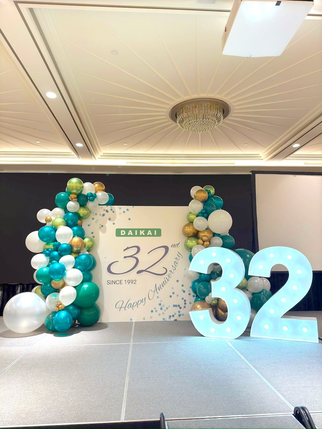
Use the logo as a reference, but ask to review the available balloon shades before approving a match. A colour on a laptop screen is not a physical material sample. Share your brand guidelines and explain which colours must stay close to the original and where a complementary shade would be acceptable.
Keep the printed logo clear even when the surrounding decoration is colourful. For example, a pale backdrop can give dark lettering its own space while a coloured garland frames the edge. Avoid treating every colour in a complex logo as an instruction to add another balloon shade.
Ask the decorator to identify a main colour, a supporting colour and any metallic accents in the proposal. This is a useful planning method rather than a compulsory formula. An all-gold display or a deliberate multicolour installation can also work when it supports the event’s visual direction.
Which combinations suit different corporate occasions?
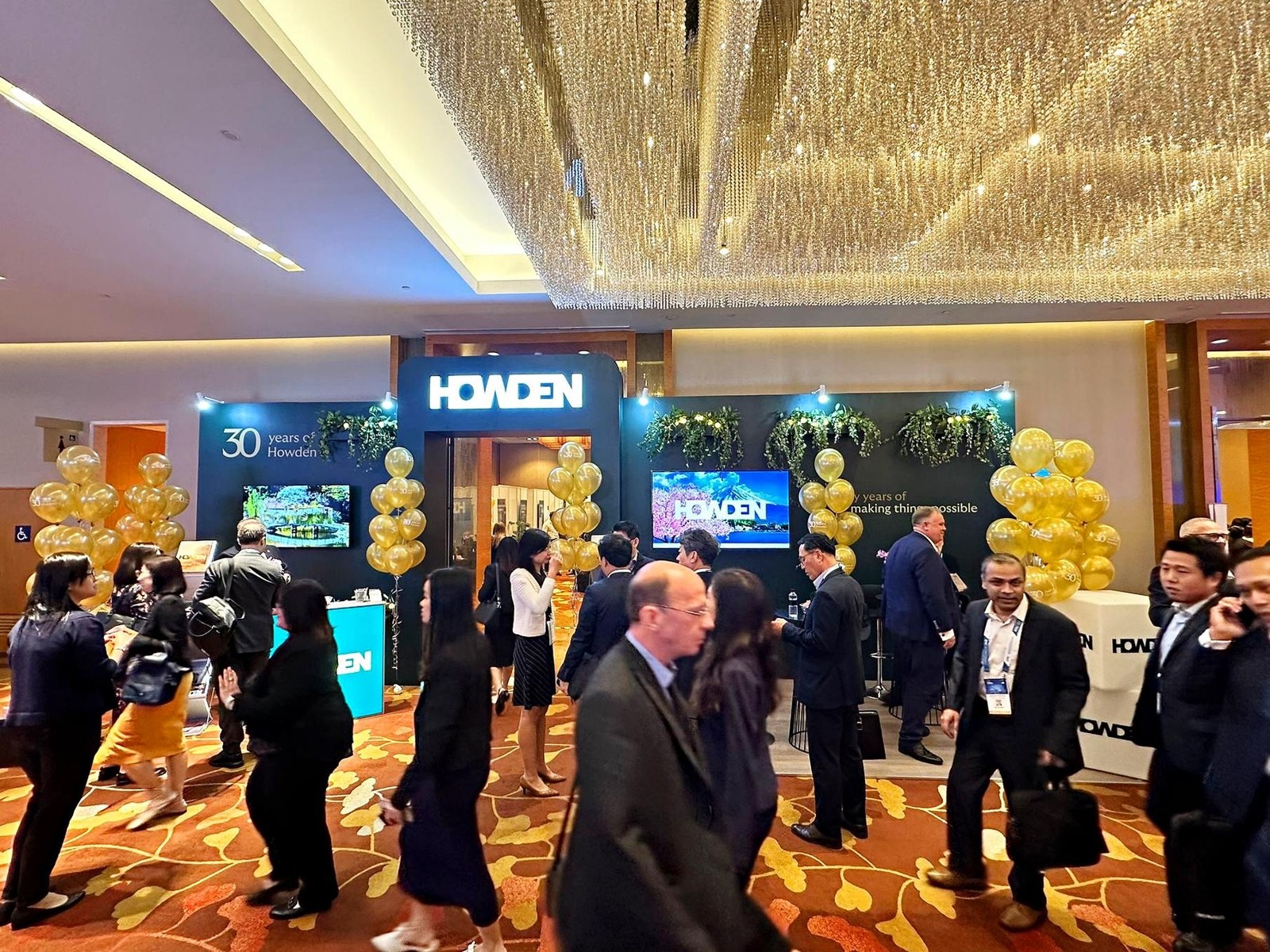
Choose a combination that relates to the occasion and existing artwork. There is no universal business palette: a formal reception, festive office display and colourful retail campaign can each call for a different treatment. Use the following options as discussion prompts, not fixed rules about how a colour will make guests feel.
White and gold for a restrained celebration
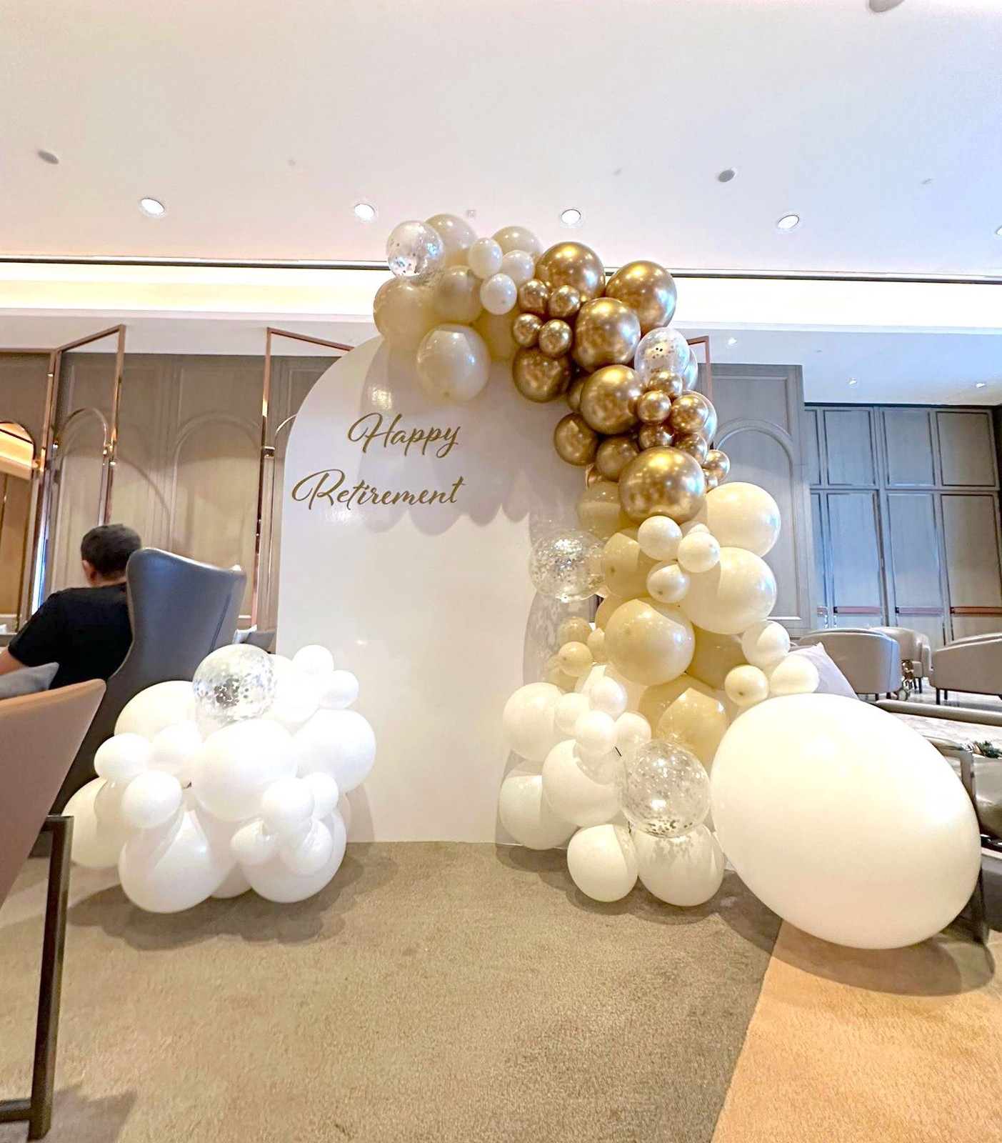
White with gold accents is an option for appreciation events, retirement celebrations and anniversary receptions. Keep the message panel readable and decide whether the gold should be a small highlight or a prominent part of the arrangement. The white-and-gold example shows how different balloon sizes can frame a simple panel without filling its centre.
Red and gold for a festive focal point
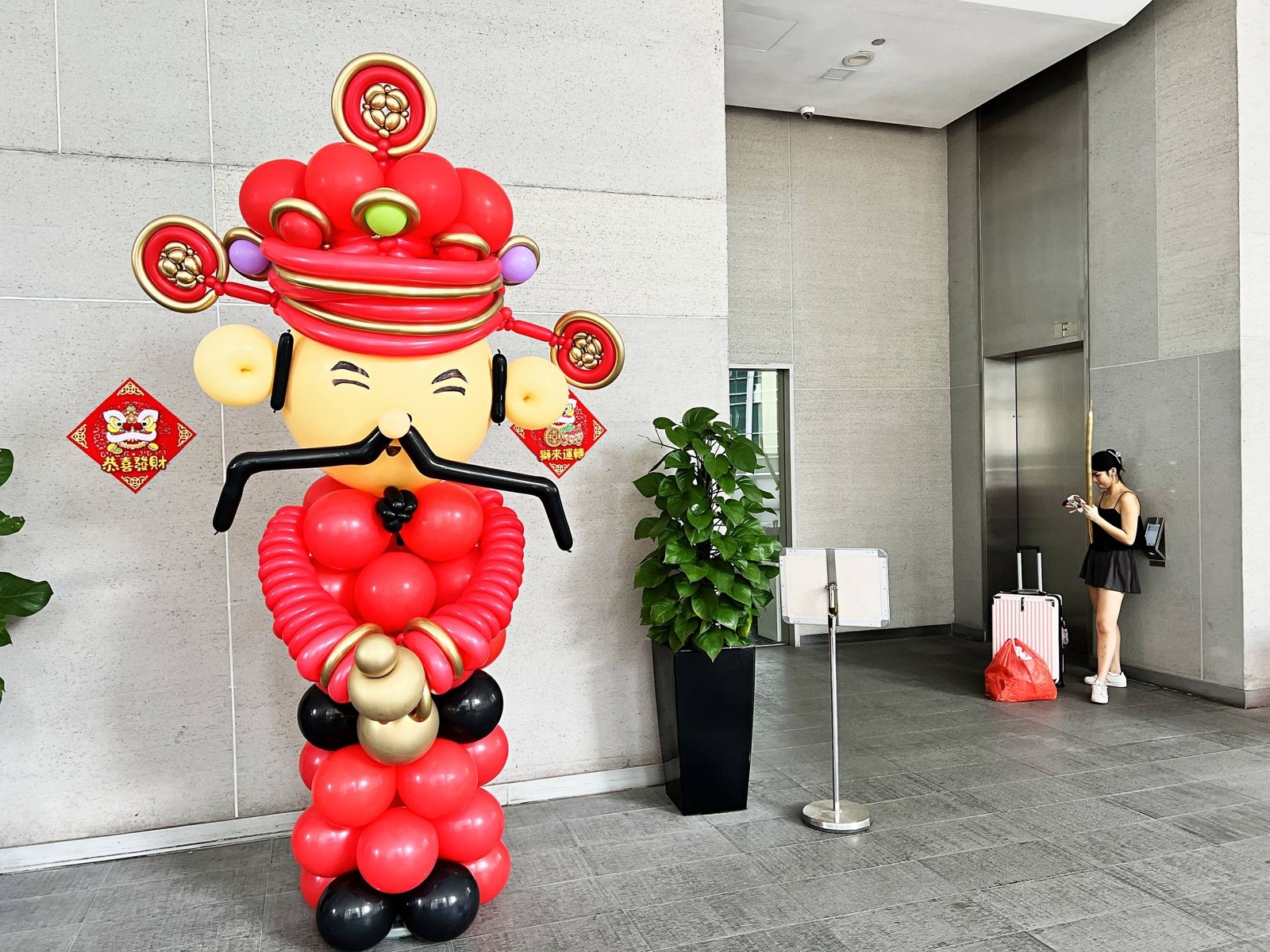
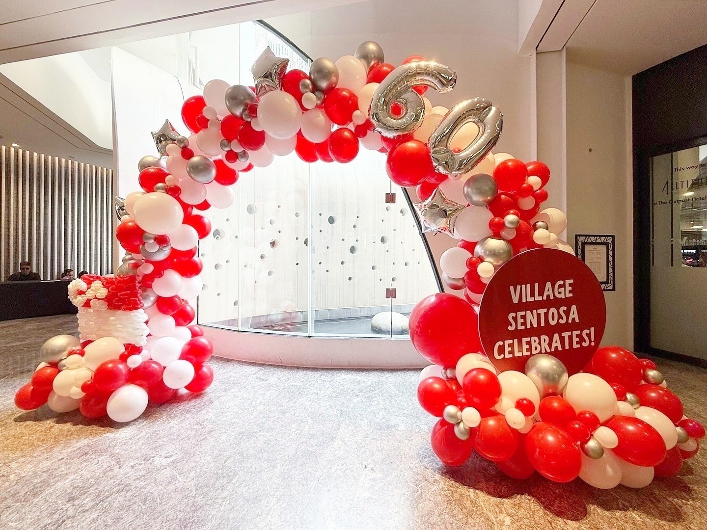
Red and gold can connect a festive sculpture with surrounding decoration. A character or sculptural display already has a strong shape, so consider keeping nearby signage and smaller arrangements simpler. Ask about the complete footprint rather than choosing solely from a close-up photograph.
Navy, red and silver for coordinated reception details
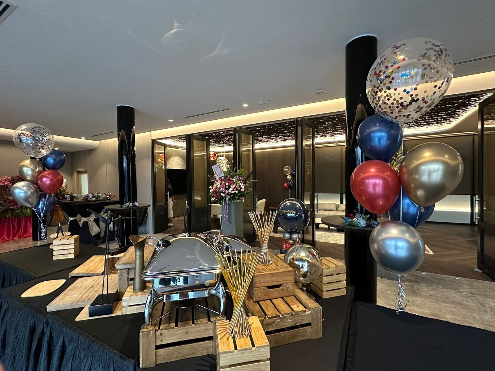
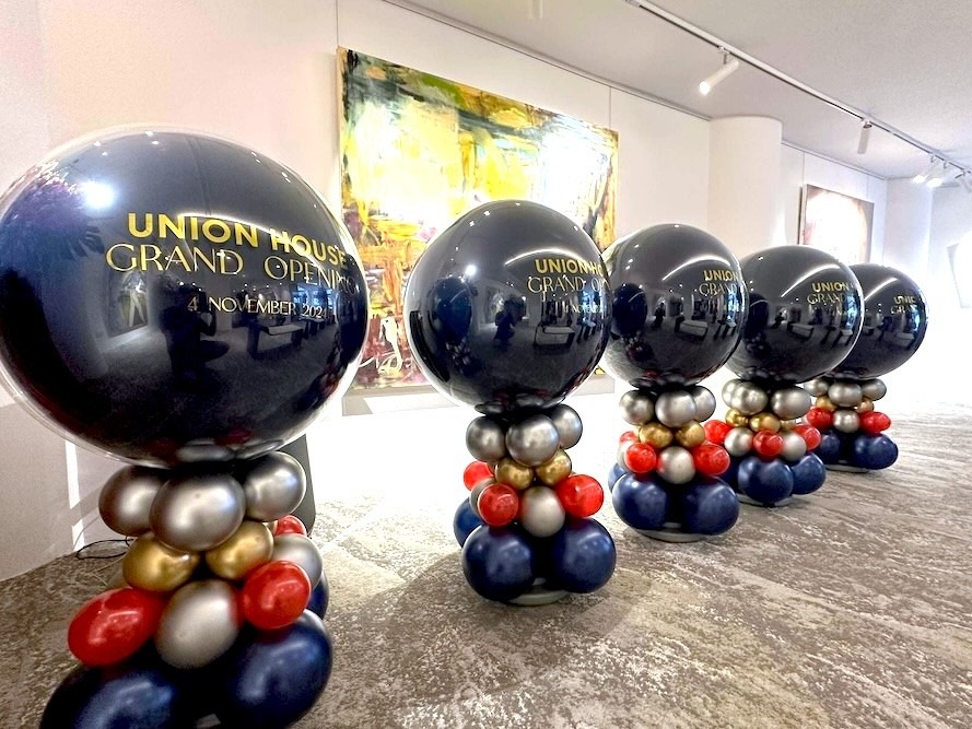
A darker palette can be repeated across smaller arrangements such as bouquets and pedestals. Instead of adding every colour in equal amounts, identify which one should dominate and which should appear as an accent. Check the combination against the actual wall, furniture and table dressing in the reception area.
Multicolour for a deliberately playful event
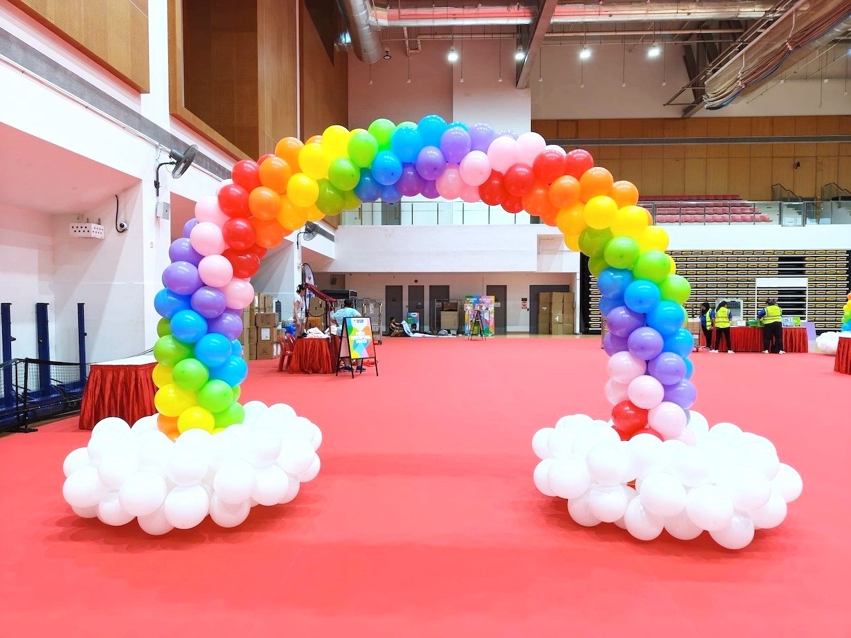
A rainbow arrangement can suit a corporate celebration with a playful theme. Keep the sequence intentional and repeat it across the main display rather than introducing unrelated shades at each station. The rainbow arch example uses white bases to separate the colour sequence from the floor below.
How should colour work across arches, walls and stage garlands?
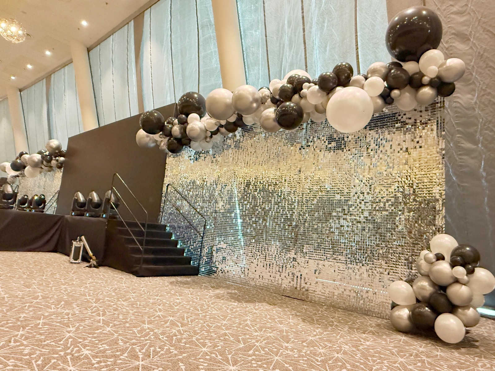
Repeat the same palette while adapting the arrangement to each location. An entrance arch frames a route, a balloon wall fills a background and a stage garland follows a longer edge. They do not need to contain identical amounts of each colour to look related.
For an entrance, decide what guests should see through the opening. The company name, reception desk or main event sign should remain understandable. Discuss the opening and overall dimensions with the decorator and venue, using the balloon arch decoration options as a service reference.
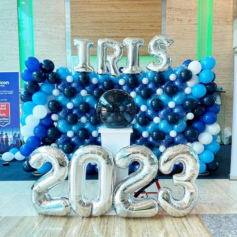
For a wall, consider the lettering and other objects placed in front of it. A busy balloon pattern can compete with a detailed message. A simpler colour arrangement may be easier to coordinate when the wall already includes foil letters, printed artwork or a launch feature.
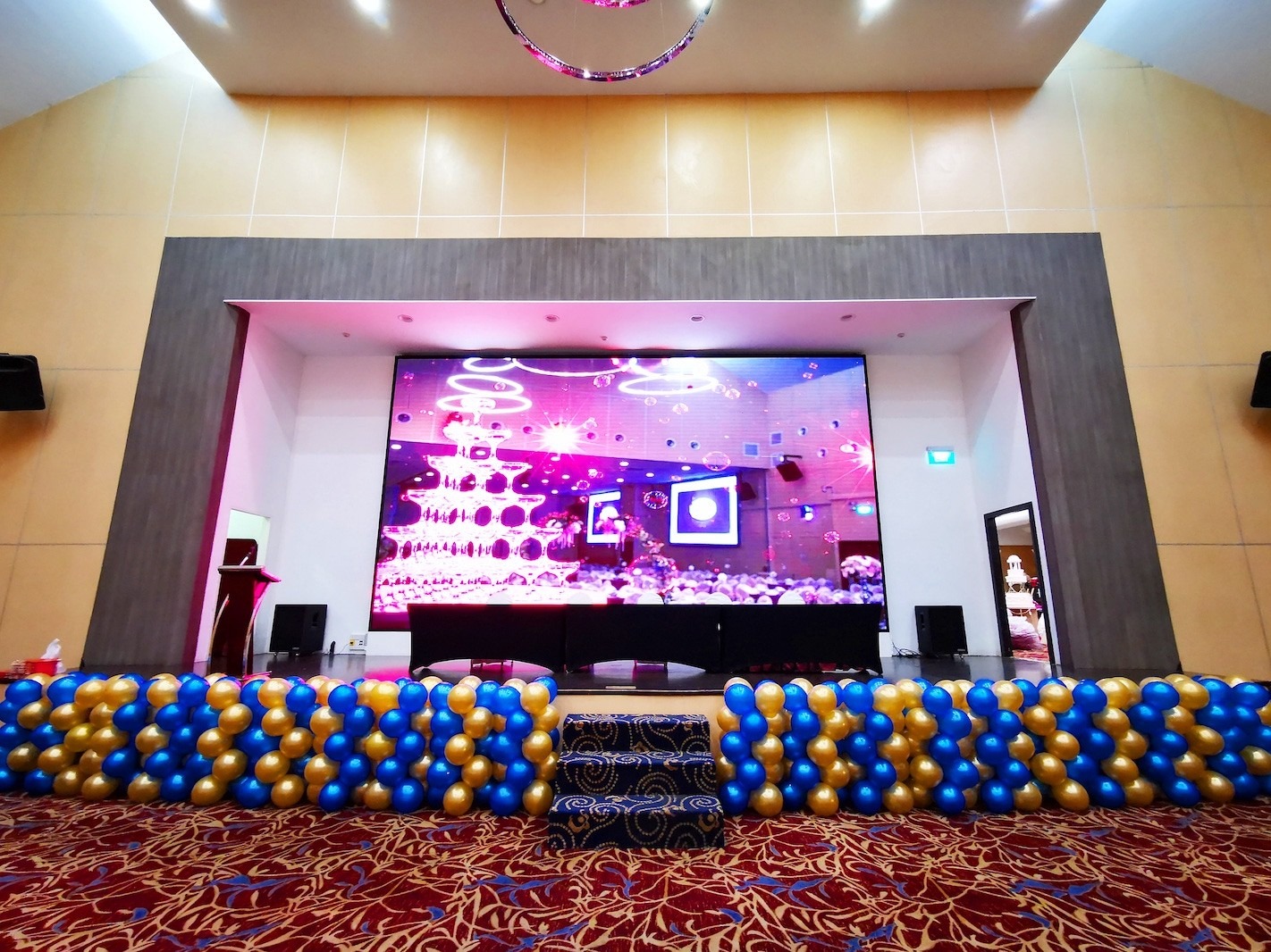
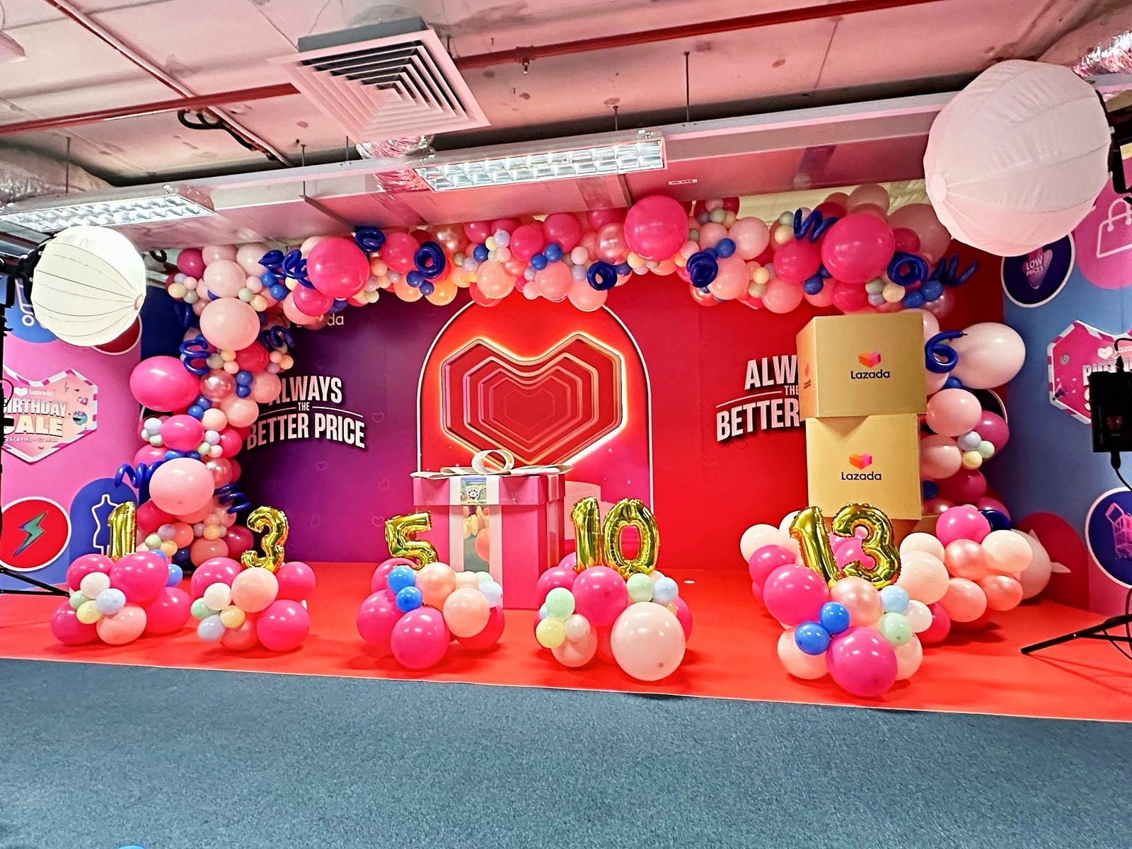
For a stage, review the colour plan alongside the presentation screen. The decoration should support the stage design without covering the screen, stairs or required signs. These examples show different ways to distribute colour across an arch, wall, backdrop, pedestal display, stage edge and campaign installation.
What should you check at the venue before approving colours?
Review the intended location in its event lighting, then check the practical placement with the venue. Take photographs showing the surrounding walls, carpet, windows and lights. A tight photograph of an empty corner leaves out the colours and surfaces that the finished display must sit beside.
Ask to see the proposed finishes with the brand artwork, especially when combining metallic balloons and reflective backdrops. The purpose is to make an informed visual choice, not to assume a screen preview will reproduce every reflection. If the event changes from daylight to evening lighting, include both conditions in your discussion.
Keep operational details in the brief too. Confirm access arrangements, the installation window, venue attachment restrictions and the collection plan with the relevant teams. Do not assume a decoration seen in another venue can be installed in exactly the same way at yours.
For general Singapore guidance, SCDF’s exit-sign requirements state that decorations must not impair exit-sign visibility. Keep this separate from aesthetic decisions and have the venue review the proposed placement. A preferred colour or shape is not a reason to obscure a required sign.
What should you send when requesting a decoration proposal?
Send a concise visual brief so the discussion covers the event rather than only a colour name. Include the brand artwork, a photograph of the intended location and a description of the occasion. If you like a reference image, explain whether you like its palette, shape, finish or scale; those are different choices.
- Event date, venue and the areas you want decorated.
- Brand guidelines, logo files and any campaign artwork.
- Preferred colours, acceptable alternatives and finishes to avoid.
- Photographs and available measurements of the proposed locations.
- Venue access information and the event team’s contact details.
- Your priorities, such as an entrance feature, stage treatment or reception display.
For a wider visual plan, discuss event decoration services. If coordination beyond individual displays is needed, review Twist Concept’s corporate event management services. Keep the brief specific to the items and support you require rather than assuming every pictured element is included.
Frequently asked questions
What balloon colours should I choose for a corporate event?
Start with your company or campaign colours and the event setting. Choose a main shade, supporting colours and any metallic accents, then review them alongside the signage and venue photographs.
Can balloons match my company logo?
Use your brand guidelines as a reference and ask to review the available physical shades. Do not assume that a colour shown on a screen will look identical in balloon material or under the venue lighting.
How many colours should a balloon display include?
Choose enough colours to communicate the theme without making the message difficult to read. A main colour with supporting shades is a useful starting point, while a deliberate rainbow design can suit a more playful corporate celebration.
Should every balloon display at an event look the same?
Keep the palette coordinated, but adapt the shape and colour balance to each location. An entrance arch, stage garland and reception bouquet can look related without being identical.
What information is needed for a corporate balloon decoration proposal?
Provide the event date, venue, brand artwork and photographs of the areas you want decorated. Add available measurements, venue restrictions and your priorities so the proposed arrangement can be discussed in context.
Discuss your corporate decoration brief
Twist Concept has been established since 2008 and focuses on corporate balloon and event decoration. To discuss balloon colour palettes for your next Singapore event, send your event brief to Twist Concept or call +65 9837 6795. Include your date, venue, brand artwork and preferred display areas so the conversation can start with the right context.